CSS3弹性布局弹性流(flex-flow)属性详解和实例
弹性布局是CSS3引入的强大的布局方式,用来替代以前Web开发人员使用的一些复杂而易错hacks方法(如使用float进行类似流式布局)。
其中flex-flow是flex-direction和flex-wrap属性的简写方式,语法如下:
flex-flow: <flex-direction> || <flex-wrap>
flex-direction: row(初始值) | row-reverse | column | column-reverse
flex-wrap: nowrap(初始值) | wrap | wrap-reverse
flex-direction定义了弹性项目在弹性容器中的放置方向,默认是row,即行内方向(一般而言是由左往右,但注意这个和书写模式有关)。
flex-wrap定义是否需要拆行以使得弹性项目能被容器包含。*-reverse代表相反的方向。
两者结合起来即flex-flow属性就确定了弹性容器在main axis和cross axis两个方向上的显示方式,下面的例子很直观的说明了各个属性值的区别:
.flex-container {
display: flex;
}
.flex-container.first {
flex-flow: row;
}
/* Initial value. Main-axis is
inline, no wrap. */
.flex-container.second {
flex-flow: column wrap;
-webkit-flex-flow: column wrap;
}
/* Main-axis is block-direction (top to bottom)
and lines wrap in the inline direction (rightwards). */
.flex-container.third {
flex-flow: row-reverse wrap-reverse;
}
/* Main-axis is the opposite of inline direction
(right to left). New lines wrap upwards. */
/* other styles just for format */
ul {
padding: 0;
}
li {
list-style: none;
}
.flex-container {
background: deepskyblue;
width: 200px;
height: 200px;
margin: 5px auto;
}
.flex-container.first {
height: 100px;
}
.flex-item {
background: tomato;
padding: 5px;
width: 80px;
height: 80px;
margin: 5px;
line-height: 80px;
color: white;
font-weight: bold;
font-size: 2em;
text-align: center;
}
h1 {
font-size: 22px;
text-align: center;
}
.flex-demo {
display: flex;
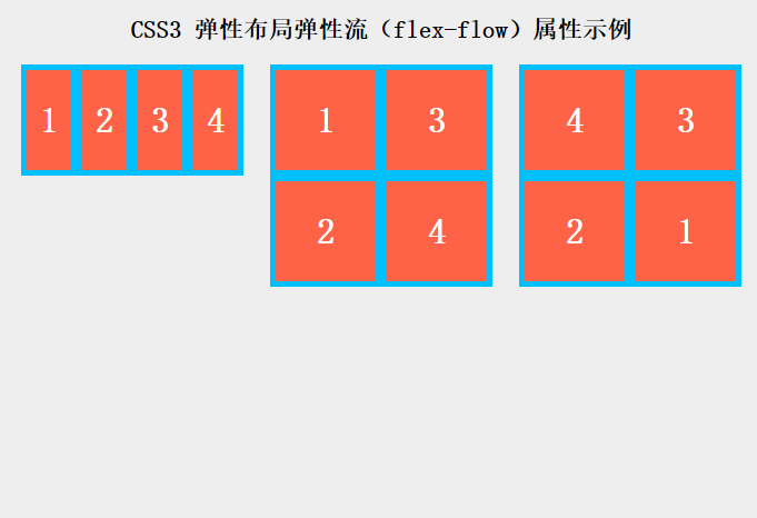
}上例中的第1个弹性项列表使用了默认属性也就是row且不拆行,弹性项的宽度在需要的时候会被压缩。
第2个列表使用了column wrap,表示主轴方向是从上往下,而行拆分的方向是行内方向(向右)。
而第3个列表使用了row-reverse wrap-reverse,表示主轴方向是行内相反方向(从右到左),新行向上拆分。
你可以通过在线实例自己试试看:http://wow.techbrood.com/fiddle/16981
 (15)
(15)
 9582
9582
 0
0
最新评论
- 相关文章
CentOS6 Apache2.2多站点HTTPS配置
可以使用letsencrypt(certbot)免费证书服务。支持多系统、多站点和多目录,支持wildcard(通配符域名),90天生效,可用定时任务自动更新。需要注意一点的是apache2.4以下版本需要在默认的ssl配置中添加如下的指令:NameVirtualHost
CentOS6 Apache2.2用域名配置多虚拟机
在CentOS下使用域名配置多虚拟机的步骤如下:
1. 使用创建非矩形网页页面元素的常用技术和实例代码
非矩形设计正在变成一种时尚,比如波浪形、菱形、三角形等:而随着技术发展,这种设计在技术实现上也变得更容易。本文以最简单的三角形为例,演示使用5种方法来...
ES6小知识:动态对象键(Dynamic Object Keys)语法简介
在ES5,对象的键(key)总是被解释为字符串。ES6允许我们使用计算的值作为对象的键,使用方括号:[myKey]const
常见面试题JS语言中四种函数调用方式实例讲解
JS的语言世界中函数(function)是一等公民,函数的调用有多种方法。普通调用这个是最常见和直接的方式:function
使用CSS3 box-decoration-break特性实现多行文本样式
当文章中的长文本被自动断行为多行文本时,其样式可能会出乎我们的设计。本文介绍如何使用CSS3中的box-decoration-break特性来处理多行元素样式。
按照规范...Three.js入门教程6 - 创建全景图和纹理
全景图非常酷。使用Three.js做一个属于自己的全景图并不是那么困难。要做一个全景图,你需要一个软件用来做一张全景图片。我使用了iPhone上的Microsoft Photosyn...
S3TC(S3 Texture Compression)纹理压缩格式详解
使用S3TC格式存储的压缩纹理是以4X4的纹理单元块(texel blocks)为基本单位存储的,每纹理单元块(texel blocks)有64bit或者128bit的纹理单元数据(texel data)。这...
CSS3图片混合(Blend)效果及其参考计算公式一览表
在Photoshop软件中,混合是将两个图层的色彩值进行合成,从而创造出大量的效果。在这些效果的背后实际是一些简单的数学公式在起作用。下面所介绍的公式仅适用于R...
WebGL入门教程6 - 光照效果和Phong光照模型
正是因为有了光,世界才能被我们看见,在3D的世界里,光照给物体带来真实的视觉感受。当光照射在某一表面上时,它可能被吸收、反射或投射。其中入射到表面上的一...
HTML网页布局:静态、自适应、流式、响应式
静态布局(Static Layout)即传统Web设计,对于PC设计一个Layout,在屏幕宽高有调整时,使用横向和竖向的滚动条来查阅被遮掩部分;对于移动设备,单独设计一个布...
inline-block元素设置overflow:hidden属性导致相邻行内元素向下偏移
在表单修改界面中常会使用一个标签、一个内容加一个修改按钮来组成单行界面,如图1所示。那么在表单总长度受限的情况下,当中间的邮箱名称过长时,会遮盖到旁边...
如何使用CSS3实现一个3D商品标签
使用3D缎带形状的标签是常见的一个设计模式,用在商品折扣、文章标题或网站推荐信息上,来突出显示重点内容,吸引用户视觉焦点。实现的方法有2种,一种是使用背...
SVG过滤器feColorMatrix矩阵变换效果用法详解
在计算机图形学(数学)中,矩阵乘法可用于把空间向量进行几何变换。我们可以把颜色的值(RGBA)表示成一个四维空间向量:color = (r, g, b, a);那么就可以应用...
更多...